Whenever create your product (workspace) with GETitOUT, you give us a first input for your marketing, enough to create at least your first material.
Remember, you can always complement this information later in the GETitOUT flow, each step you see in the creation of a product is a section that awaits more information in order to successfully generate your messages and materials.
Complement the Design information:
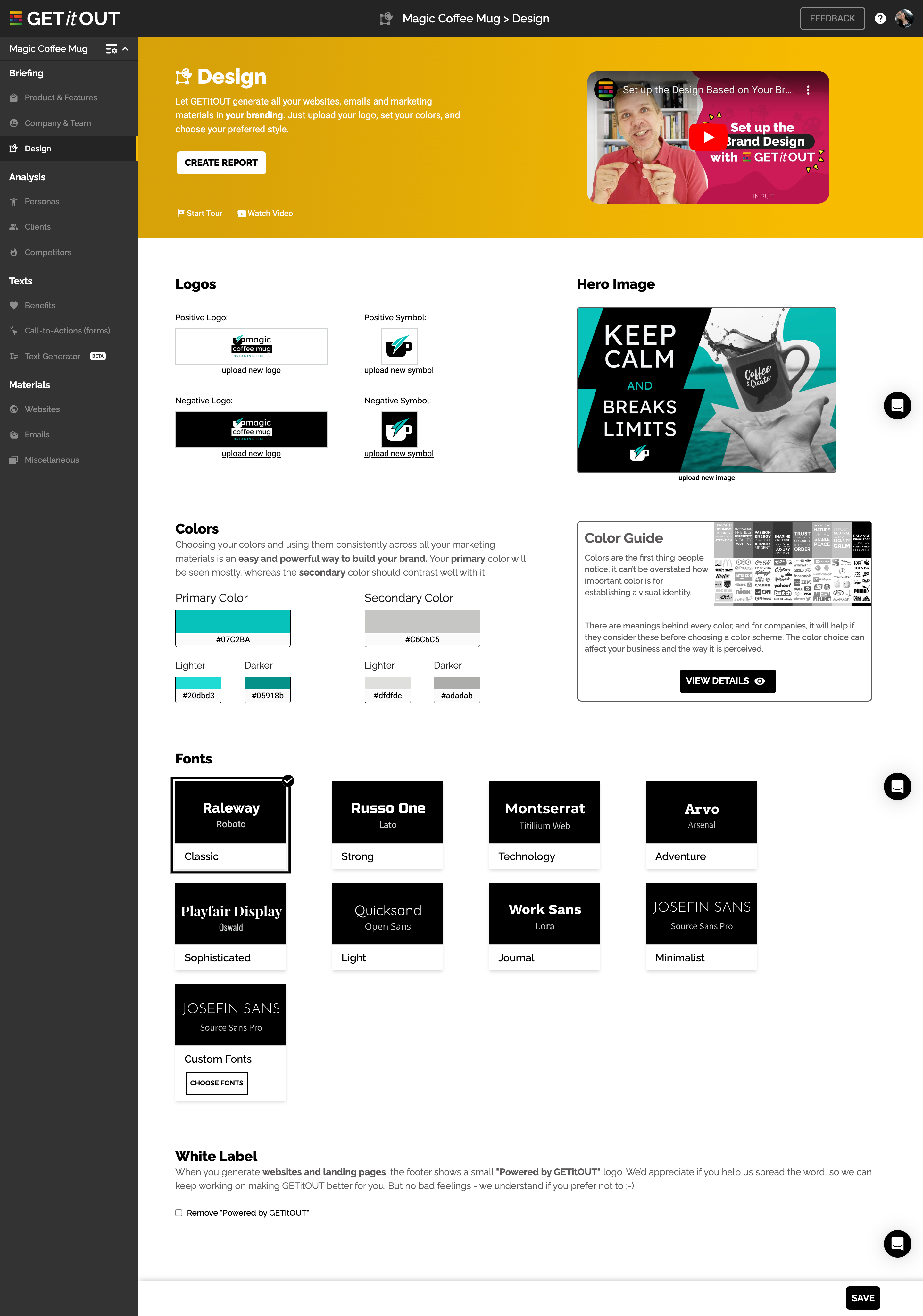
This section will help you generate websites, landing pages, emails, presentations, collateral materials and many more, in your design with the image that represents your brand, without worrying about these little details.
It will also be a good briefing for your team so that they know how to graphically develop your brand or that of your clients.
🖱 Upload your logo in different versions
Upload the logos that work in different versions for your brand, we highlight two main ones that will work for light backgrounds (called the Positive version) usually have their original colors, and another version that will work on dark backgrounds (called the Negative version) and that usually have light or high contrast colors.
Flexibility is necessary to produce high-quality materials, it'll help a lot if it is 1000px or more.
📸 How about a featured image?
Choose the image that stands out from your product, the one that you will use the most to represent your brand, some call it Cover or Banner, it could be an element that you usually show.
Add it and change it when you want to update your image a little bit. Soon we'll help you to create these images at GETitOUT.
🖍 Colors represent the concept of the product
We simplify the design process based on two important colors, a primary (main) color that will be the protagonist of your materials and normally occupies 75% to 85% of the final design.
You will also have a secondary color that will occupy the lowest percentage and complement the main color to give strength to your brand.
For both colors, you will find 2 variations that appear as a lighter version and a darker one, so we will have flexibility to implement it in your materials.
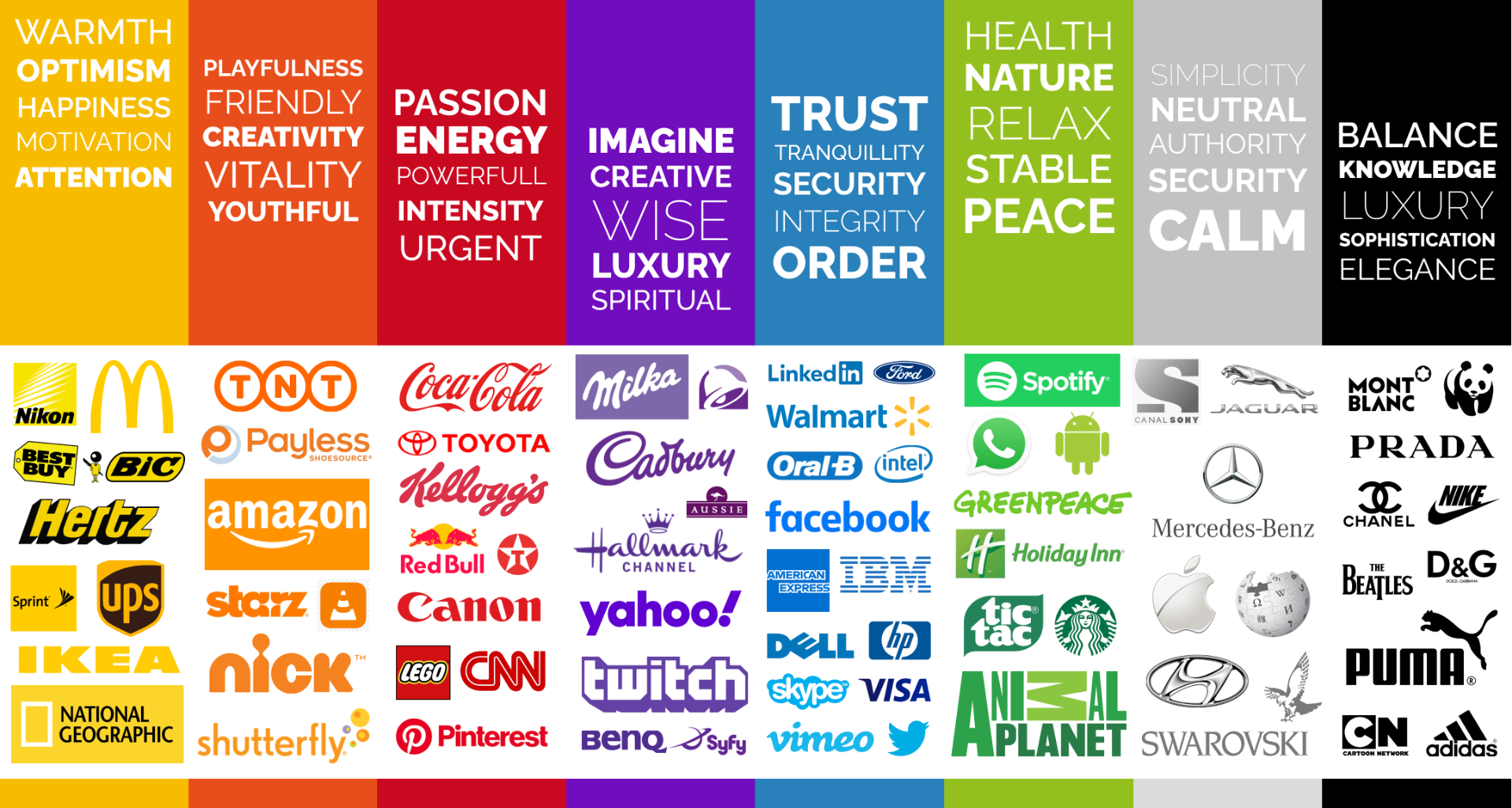
Still not clear about the graphic line of your brand? Find a clear help that explains what colors to choose according to your concepts.
⌨️ Fonts represent the essence of your brand.
Choosing legible fonts that convey the message in a clear and understandable way is of vital importance, it’s the strongest visual element besides color. Tip: choose fonts with variations to create hierarchies easily.
You can create your style with custom fonts thanks to the strong library that comes from Google Fonts.
💻 White label in your marketing materials.
Configuration that will allow the GETitOUT brand to be removed from the marketing materials that currently have it, this brand is only found in Websites type templates, these are Landing Pages and Thank You Pages.
How to activate the White Label, and what does it affect in your marketing materials?
That's it!
Any questions? Shoot us an email: [email protected]
We will be here to help you. 🙌🏻